Travel app
Interface Design
Figma Link: https://www.figma.com/design/eredp4rM50I6ftfgslDZEy/CCT478-Prototype?node- id=0-1&t=TXUPqVlYMyMdxaNe-1
I created three frames prototype of a travel app.
I put the link to my prototype above, and I put the screenshot below for better explanation.
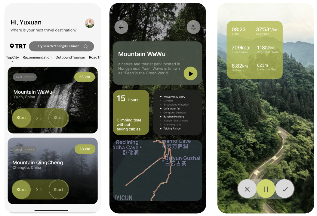
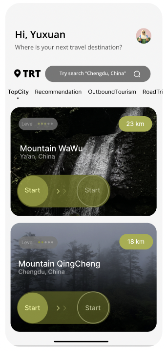
The prototype begins with the homepage. It contains a personalized welcome greeting for users, and a search bar to choose different destinations.
Below, recommended destinations are displayed with key details like difficulty level, distance, and location.
To start exploring a destination, users can interact with a slider labeled "Start" beneath each card. (In this prototype, I assumed the users have chosen the Mountain Wawu).
The “sliding” movement simulates the action of “moving forward”, which makes users feel more immersed than “clicking”.
Then, Sliding the button transitions the users to the second page.
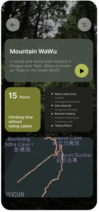
The second page provides more information about the chosen destination.
This includes an official description, total hiking distance and time, key attractions along the route, and a trail map. This information allows users to decide whether this destination suits their interests and abilities.
If users think this place isn’t for them, they can click the back (left) arrow on the top left corner to return to the homepage and browse other options.
Alternatively, if they found this place interested, they can click the "play" button to begin the hike.
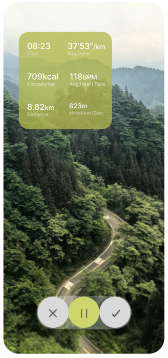
This action takes them to the third page, the hiking tracker, which provides real-time data such as time spent, current distance, current calories loss, average pace, elevation gain, and heart rate.
The tracker helps users stay informed and motivated during their hike, and at the bottom of the screen, a checkmark allows them to complete the hike and return to the homepage, as a successful ending to their adventure.